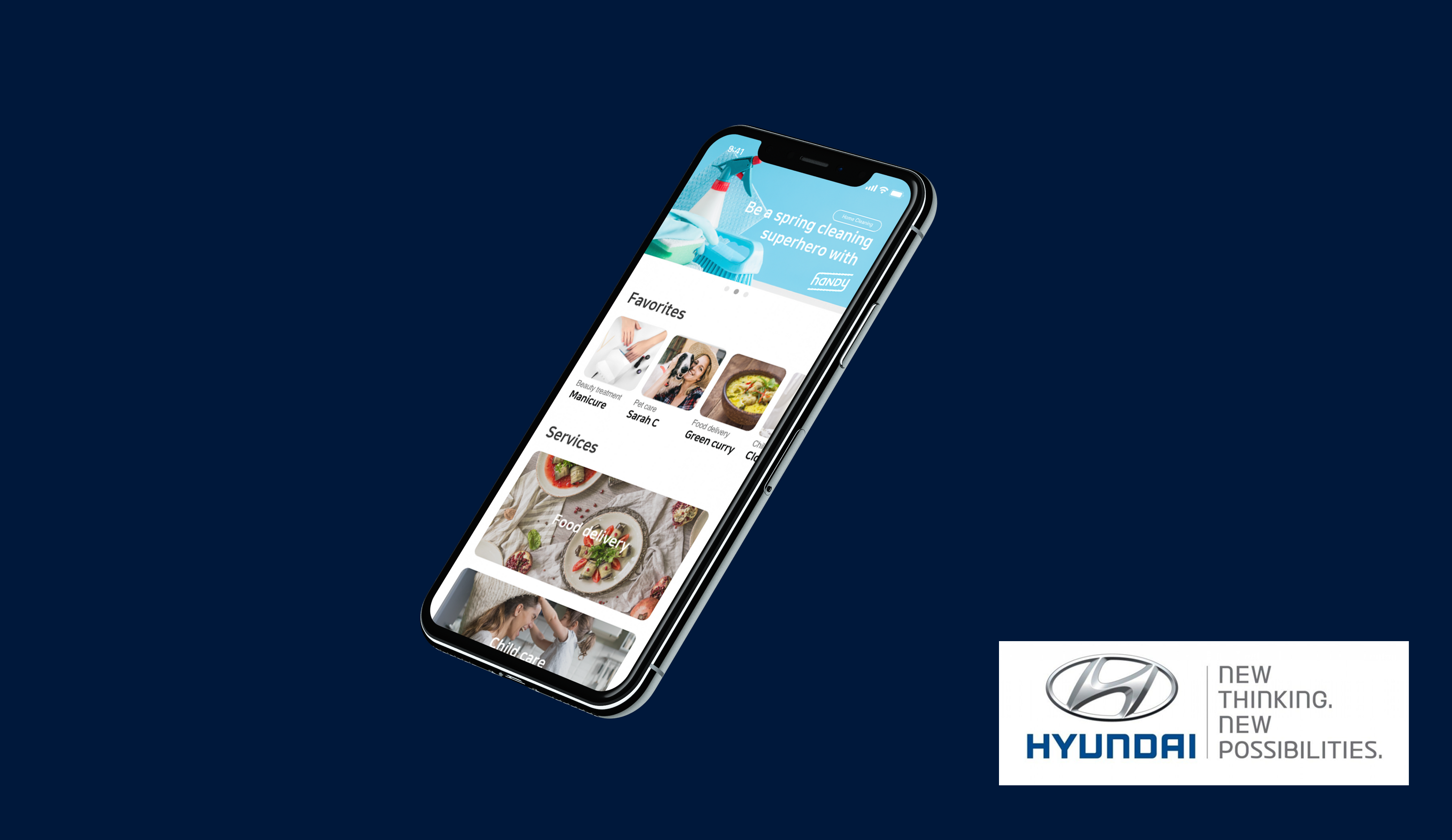
Role
Senior product designer
Client
Hyundai Motors
Team
12 Engineers
2 Product managers
Problem
Create an app combining frequently used lifestyle apps.
The existing apps were outdated and hard to use.
Create an app combining frequently used lifestyle apps.
The existing apps were outdated and hard to use.
Solution
As the sole designer on the team, I created a more intuitive and consistent UI design for our users.
I worked closely with engineers and PMs on a cross-functional team during this project.
As the sole designer on the team, I created a more intuitive and consistent UI design for our users.
I worked closely with engineers and PMs on a cross-functional team during this project.

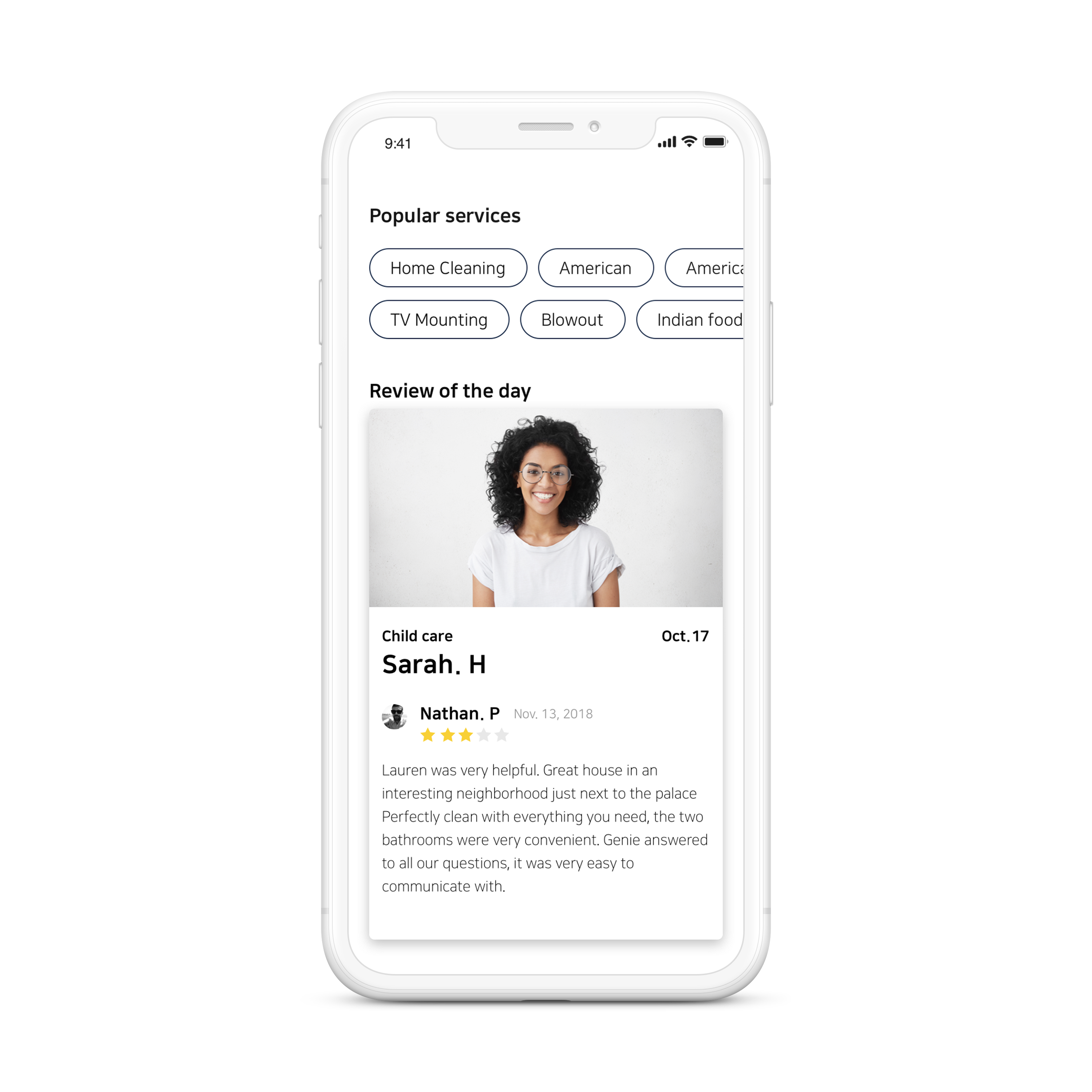
User’s pain points
Our users use various apps daily to get their chores done — Cleaning, Pet care, Food delivery, Beauty appointments etc. Here are the main pain points we learned from our users:
- Many apps were outdated and hard to use
Old payment system (more steps to make a payment), having services that no longer exist
- Time consuming
Checking out each services from each app.
- Hard to keep on track of the things they need to do.
- Inconsistent design
between services.
Business owner’s pain points
- Difficult to advertise their new promotions.
- It is time consuming and costly to frequently update their apps.
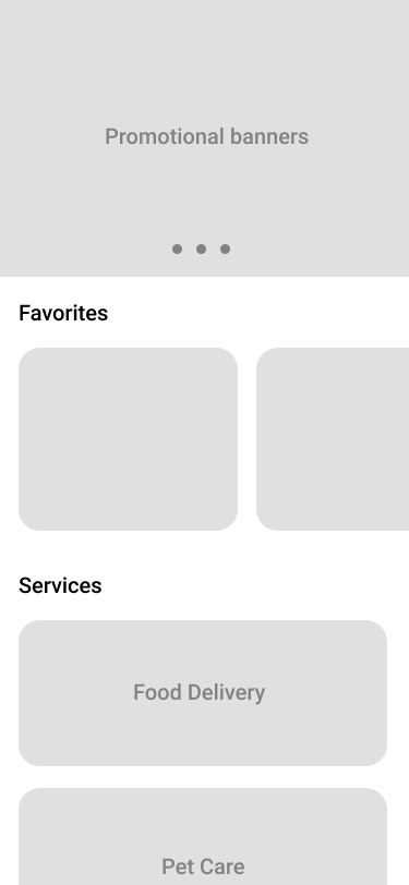
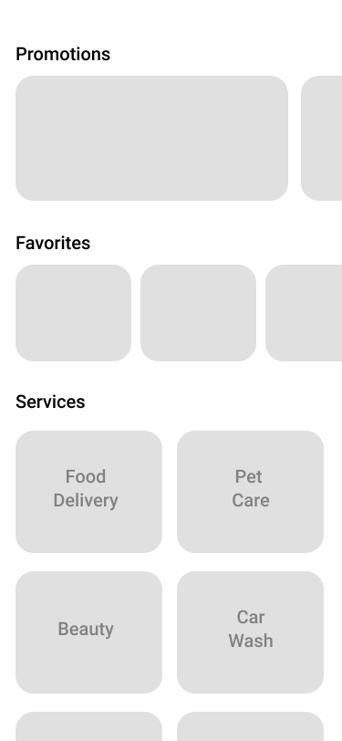
Challenge 1
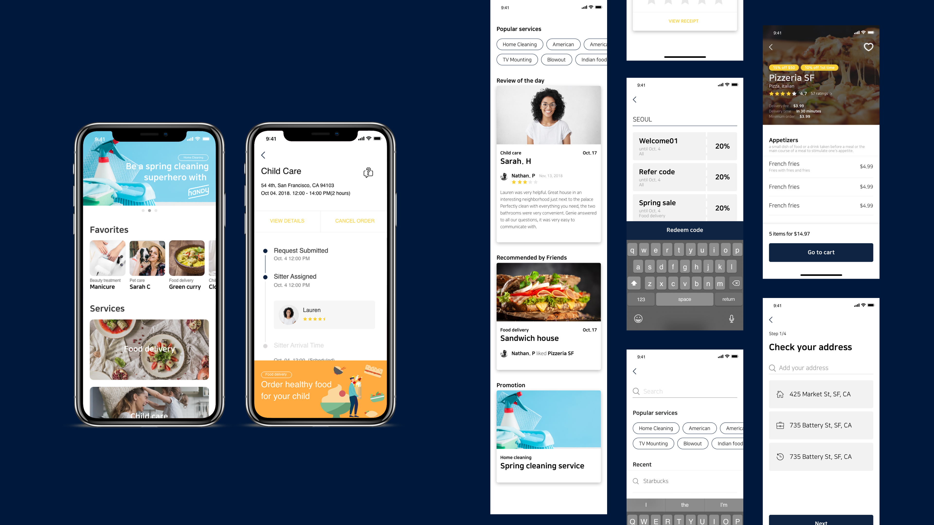
Desinging the main screen
We found three opportunity areas from both the users and the business owners.
Promotional banners : for the business to advertise their promotions to a wider variety of audiences.
Favorites :
For the users to re-visit their favorite services at once.
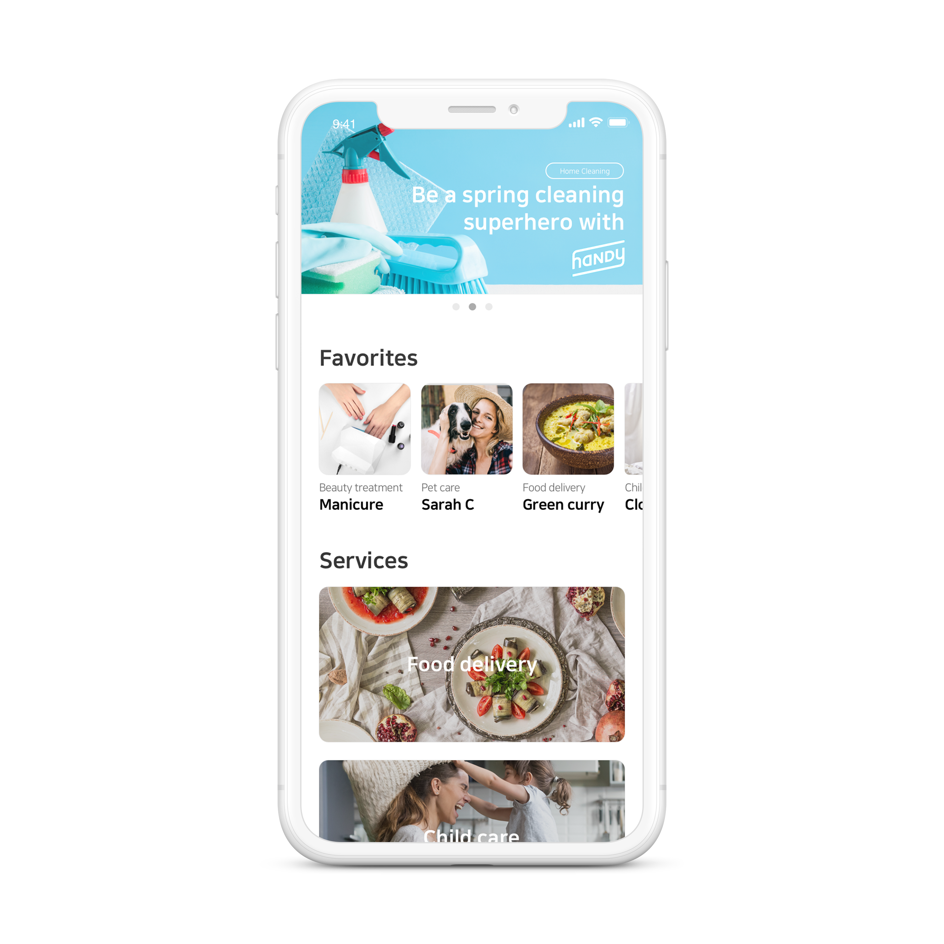
Services :
A consistent UI design for different services and for the user to check out multiple orders from different companies at once.
Favorites :
For the users to re-visit their favorite services at once.
Services :
A consistent UI design for different services and for the user to check out multiple orders from different companies at once.

Ideation
From the user feedback, we narrowed the list down to the 3 most popular options from these designs.
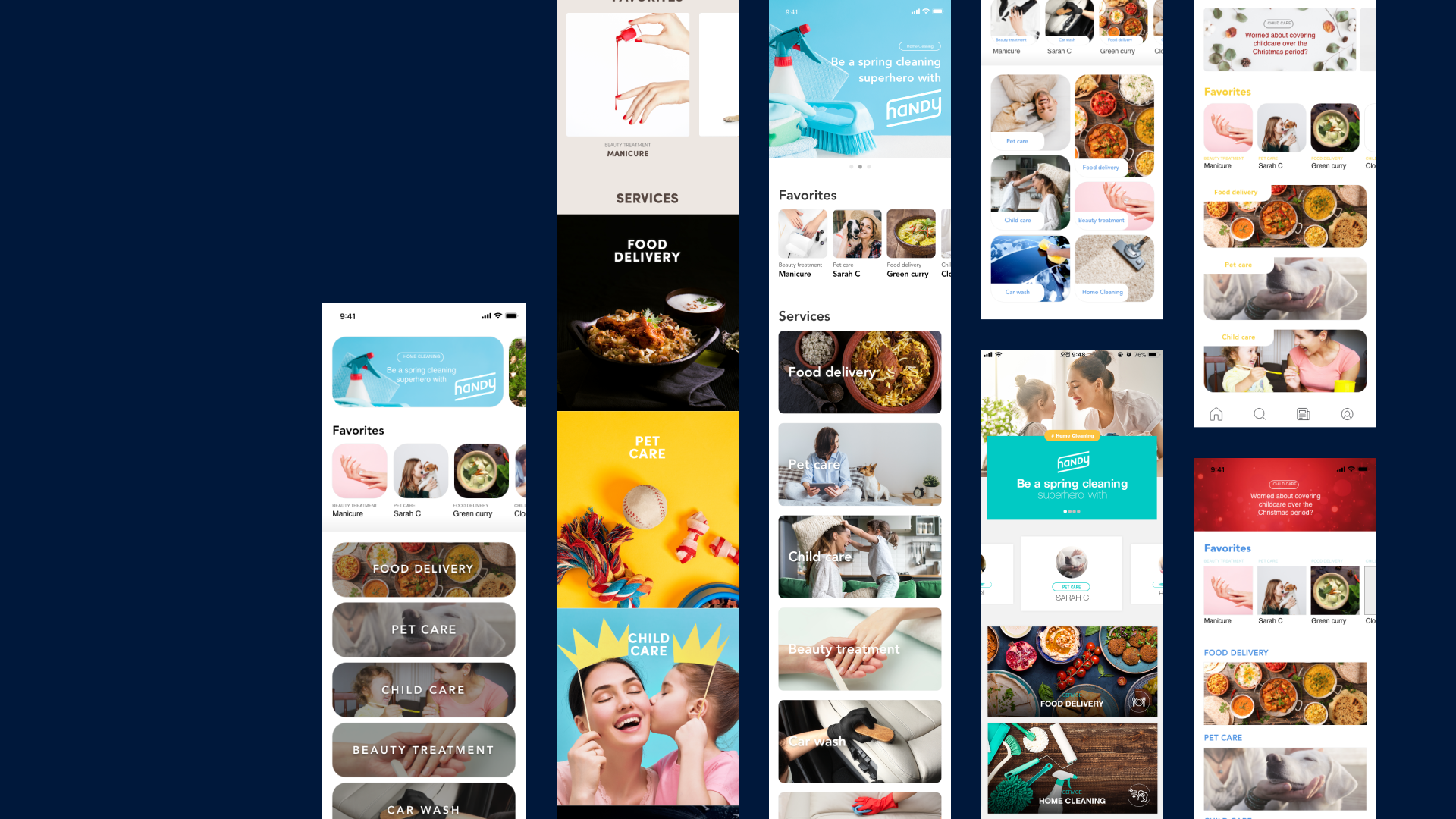
The three most popular options from our users.

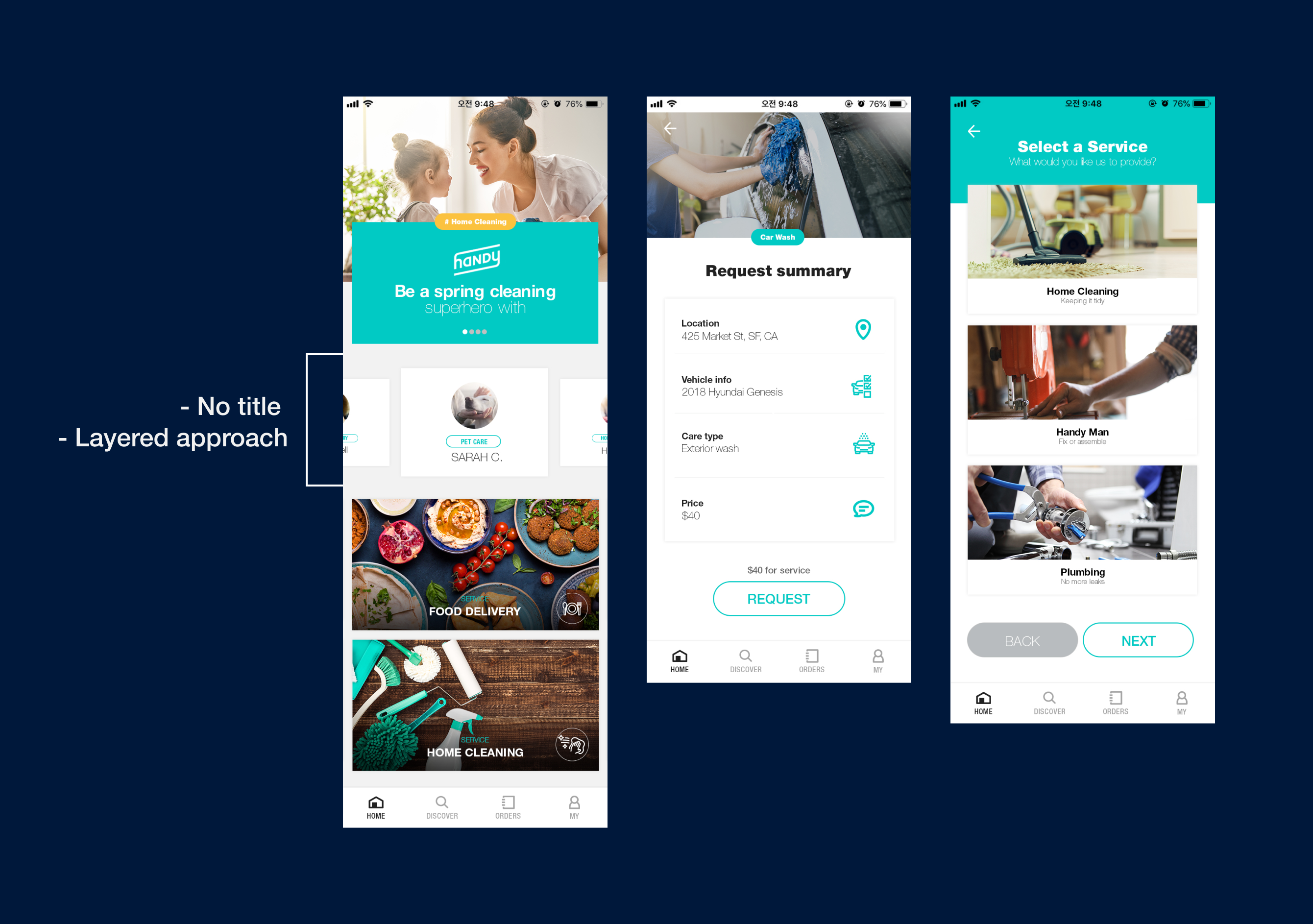
Option 1
- This design utilises a layered approach to help users intuitively understand the way that they navigate through the application.
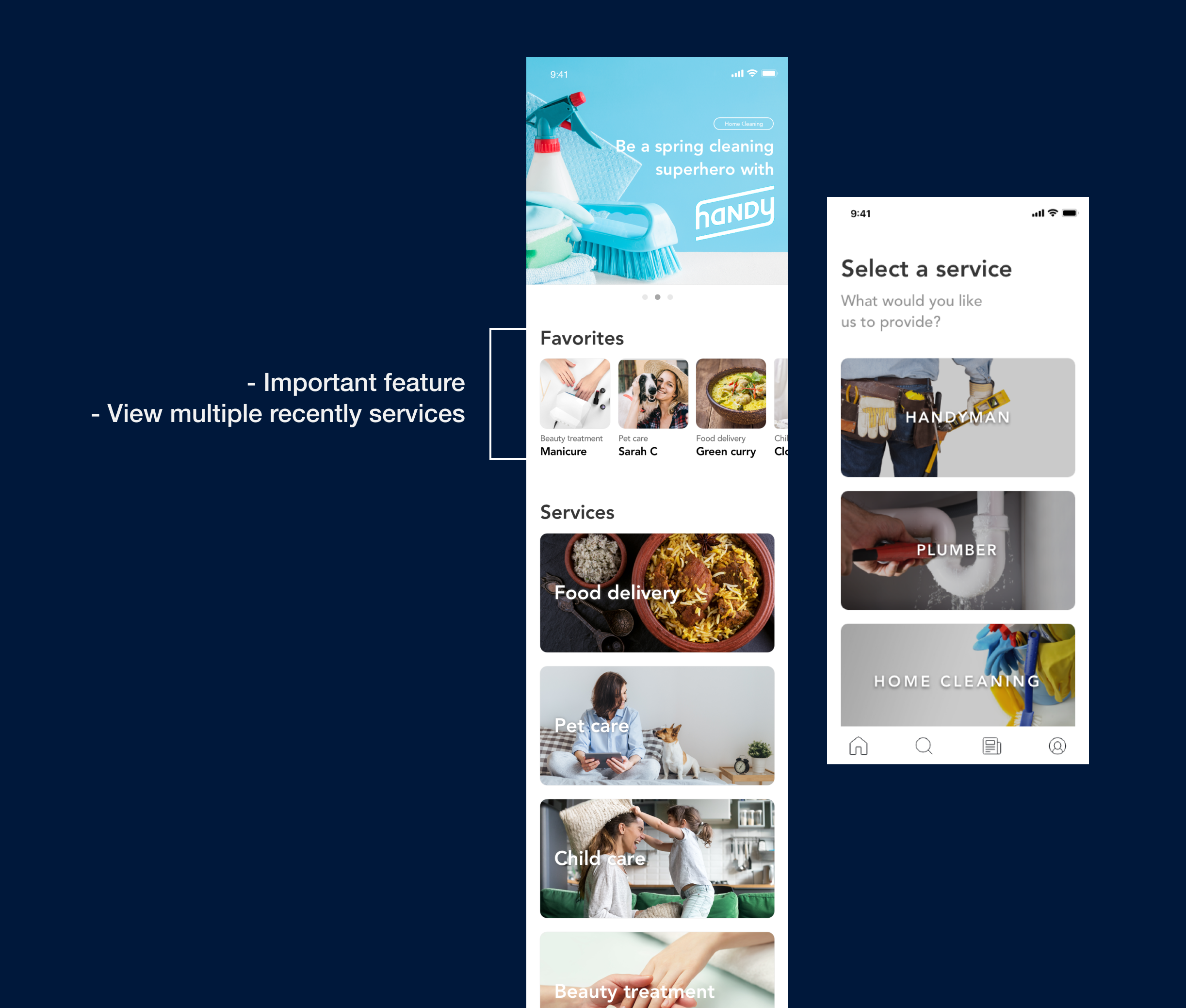
Option 2
- We tried to activate photography to create a more compelling narrative.
- The contents in the Favorites section were designed smaller for the users so they could see multiple recently used services at once.
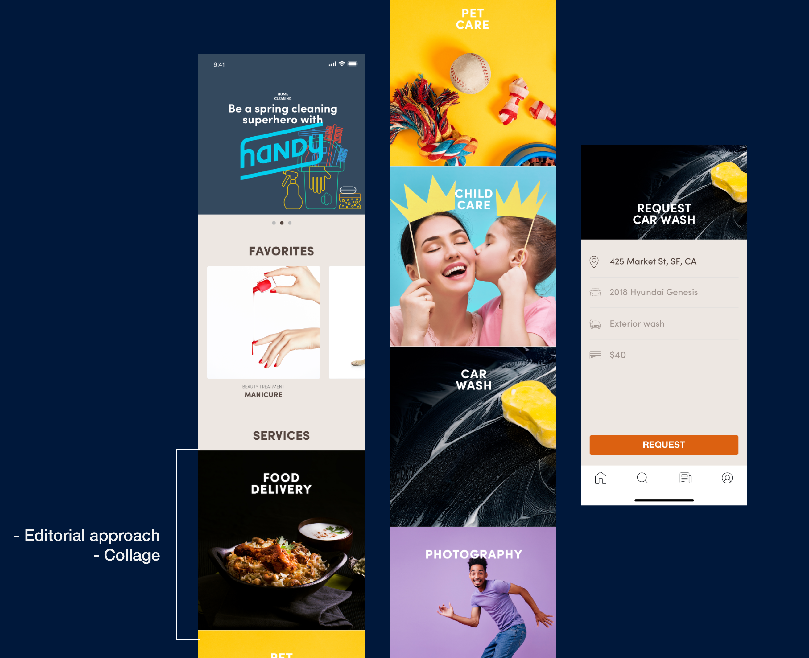
Option 3
- Photographic collage and composition to tell a story to the users.
- One of the painpoints was that Askhub offered 10 services, and the photographs were taking a lot of space. This made it harder for the users to scroll and find the service they were looking for.
Feedback from the users:
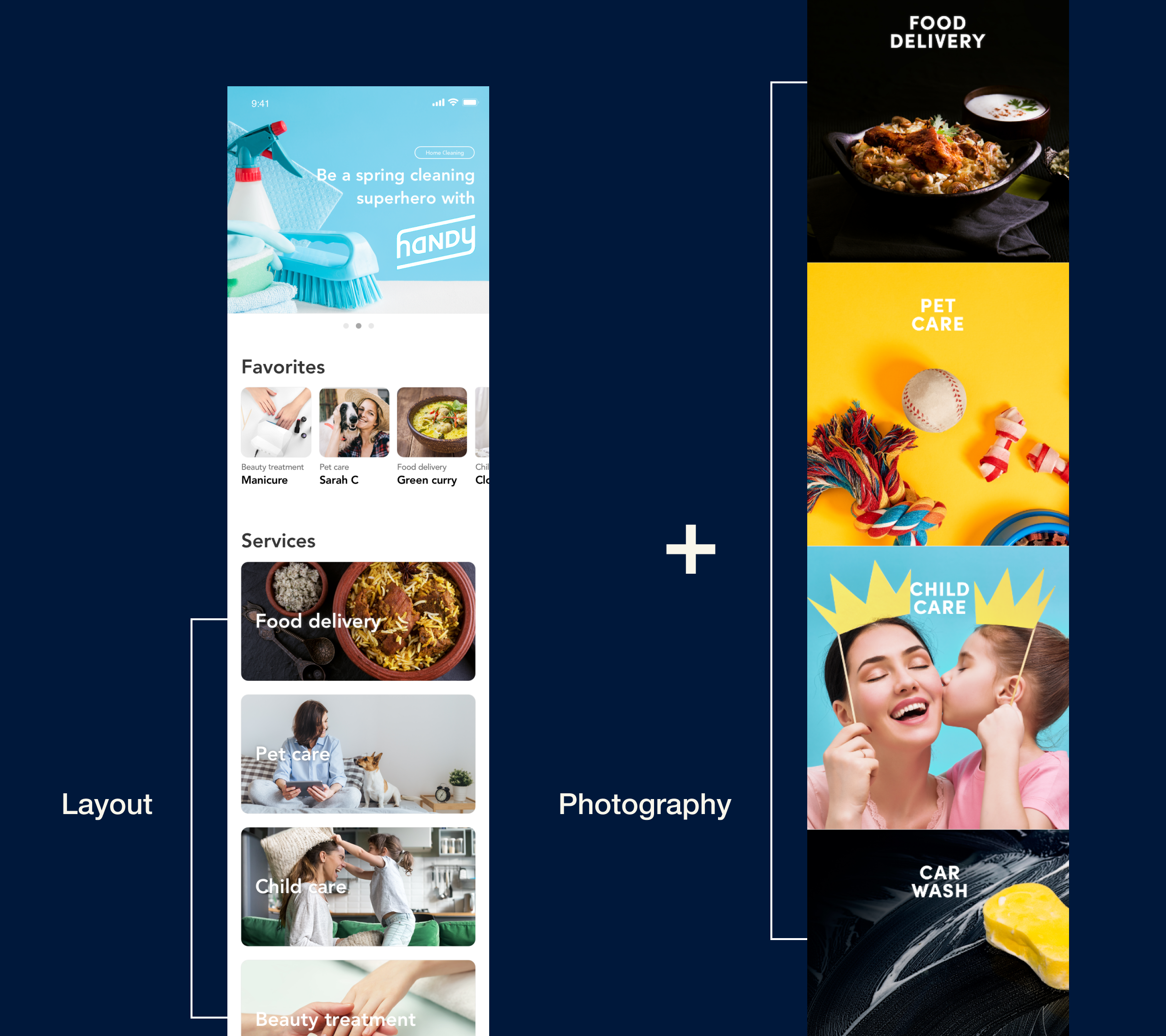
The users preferred seeing multiple services in one screen without scrolling down, but they were more engaged with the photos that were used on the right.
After the feedback, we decided to find a way to have more engaging photographs to attract users.
Final design before the 2nd user feedback
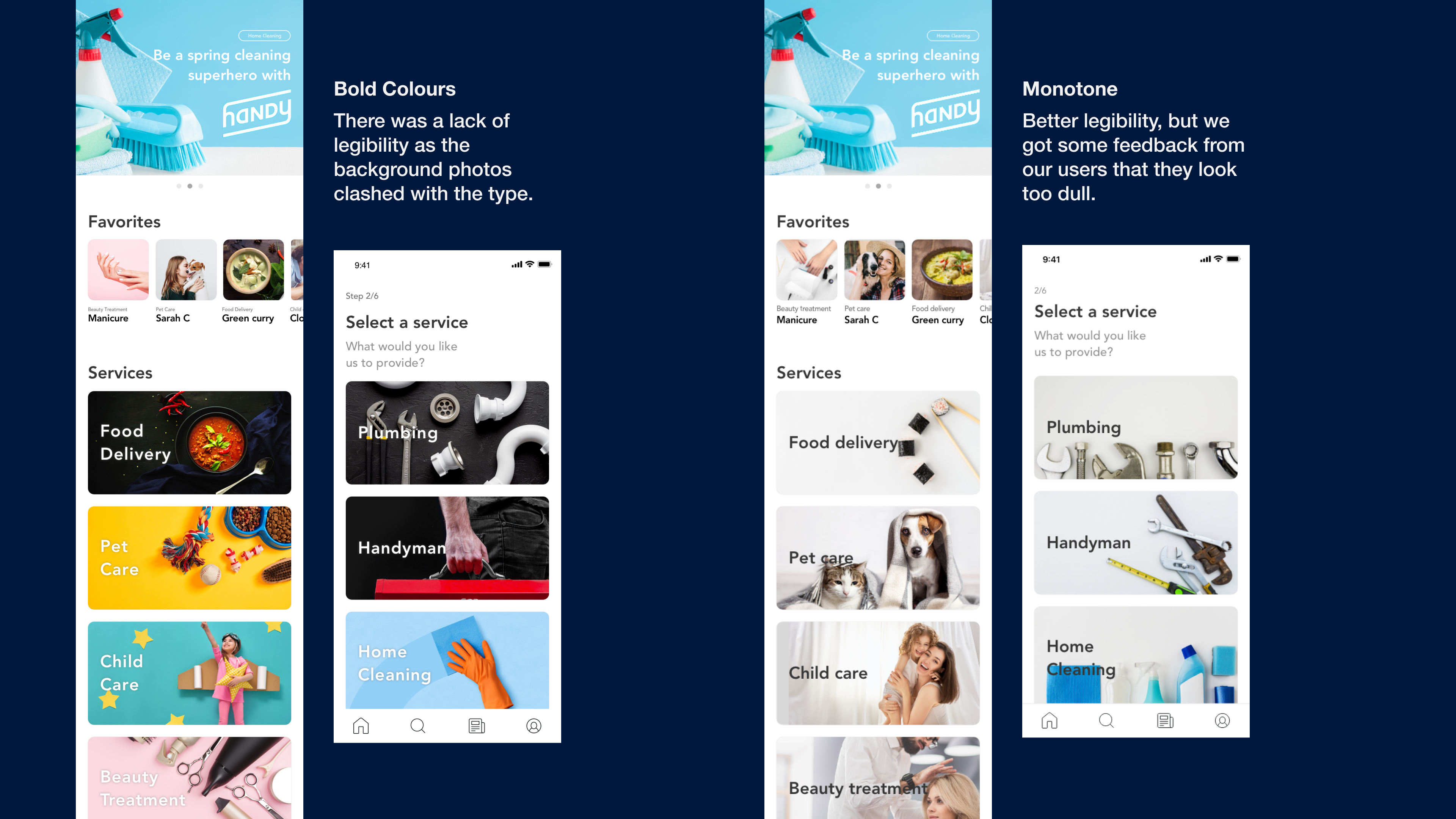
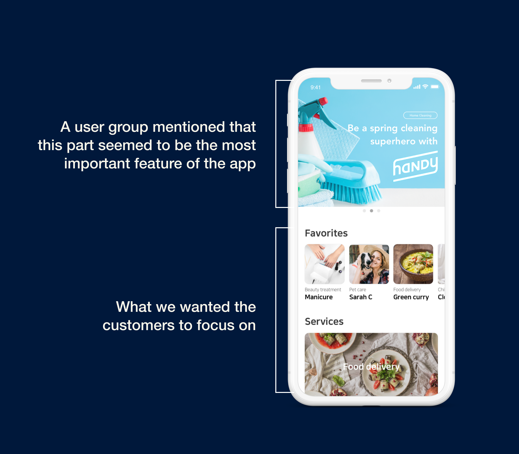
User Feedback
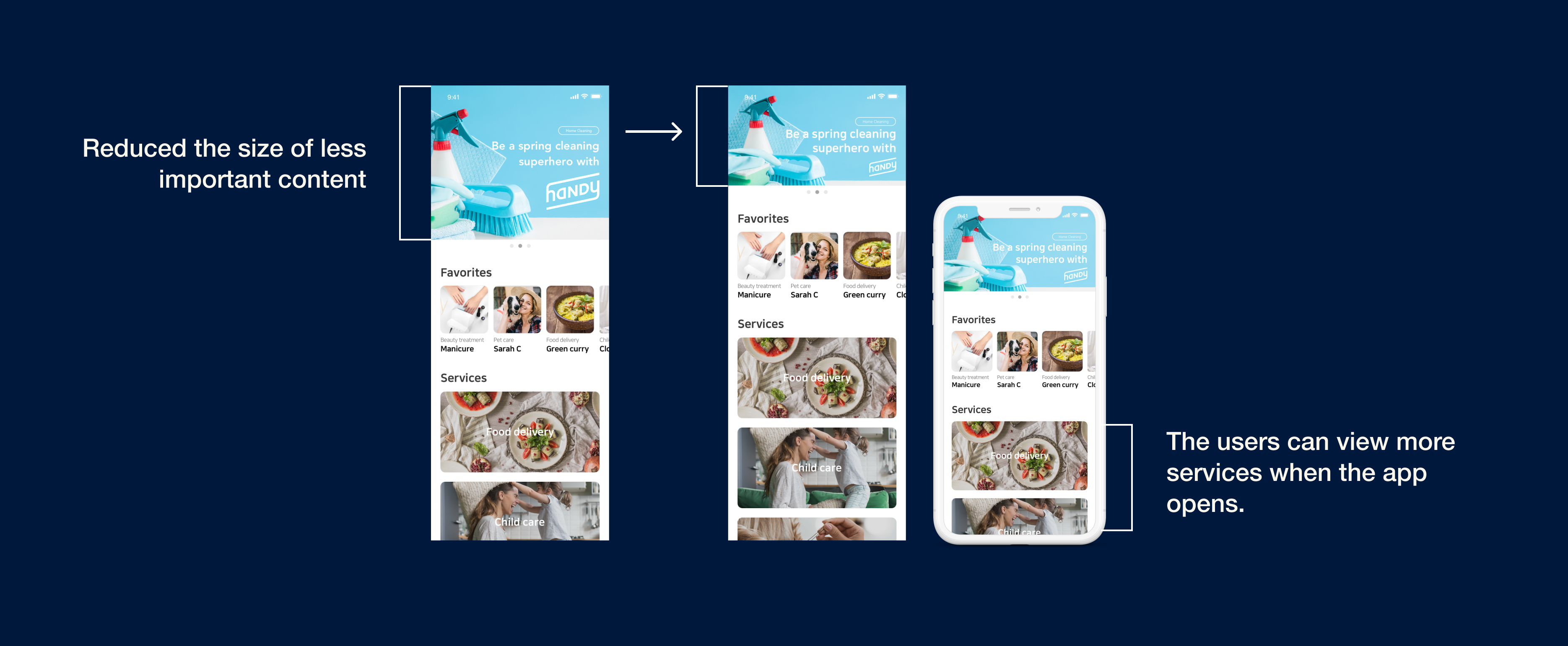
After getting the final design approved, we tested the design on a mobile device. However, the promotion banner was taking up almost half of the phone and it was harder to access the main feature of the app — the list of various services.
Solution
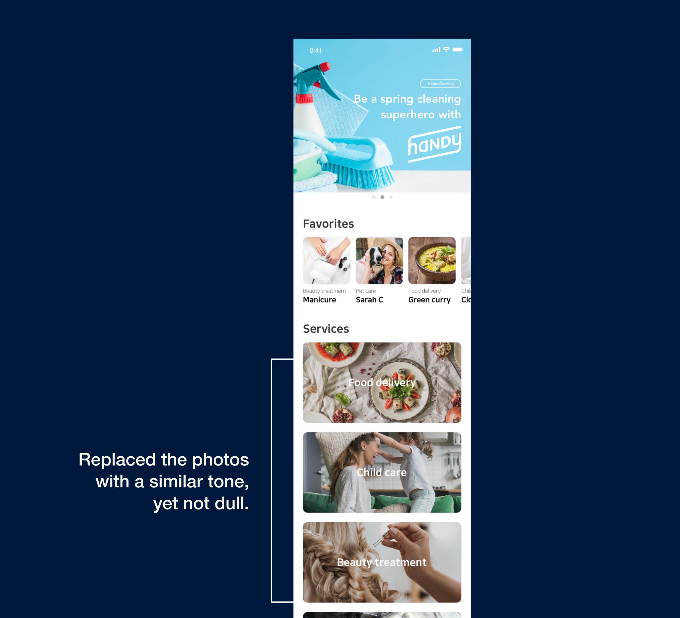
Further User Feedback